


I wanted to use a sports story because I like sports so I knew I would be more industrious in this project. I chose Derek Jeter because I knew there would be a lot of stories to choose from so I wouldn’t be trapped in to one bad story.
For my body text, I chose Garamond. I think it is a very effective typeface as you explained it in class. It is easy to read and very versatile. In the sidebar, I used Century Expanded LT Standard. I felt it was wider than Garamond so it was a nice contrast to my body text. My photo captions, credits and dek were all Joanna MT Standard. I like Joanna because it has a thin stroke which allows me to make it bigger without it being blocky. My magazine banner is Bickham Script Standard. It looks very fancy and looks similar to how the Yankees often print their team name. Finally, the headline of my story is Frutiger LT Standard, which I liked because I could erase the dot of the I and replace it with the ball. Also, I used the blackitalicized version of it because it gave it a sense of motion.
Color of background of banner: C=0. Y=0, M=0, K=100
Color of headline: C=76.67 M=68.08 Y=63.8 K=80.32
Color of background of sidebar: C=0 Y=0 M=0 K=87
Image sources:
Cover picture: http://www.femalefan.com/wp-content/uploads/2009/02/82848356.jpg 2153 X 3000
Picture next to headline: http://fridayniteyanks.files.wordpress.com/2008/09/derek-jeter.jpg 1518 X 1917
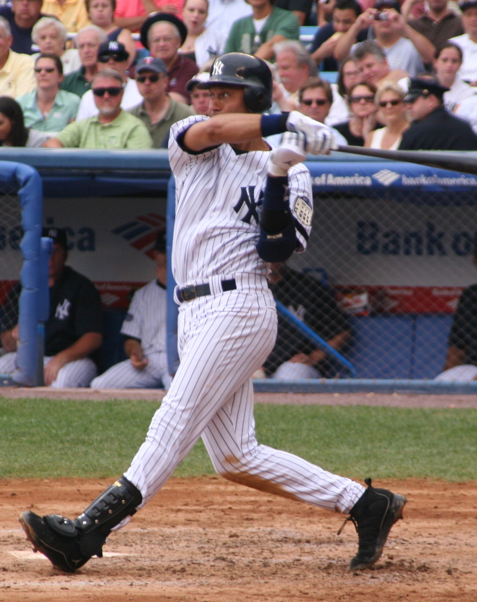
Picture on page 6: http://enquirer.com/editions/2001/11/01/jeter_zoom.jpg 517 X 600
Back cover: http://zellspinstripeblog.files.wordpress.com/2009/11/we-have-the-yankees.jpg 498 X 930
No comments:
Post a Comment
Note: Only a member of this blog may post a comment.