
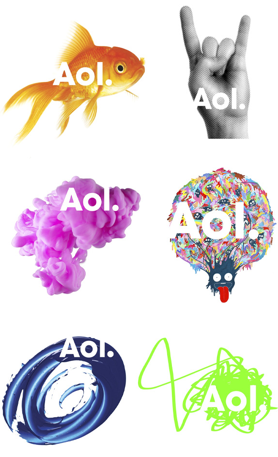
I chose the new Aol logo for my demonstration of a Gestalt principle. Aol recently re-branded, choosing to rely on the figure/ground principle in their logo (or, at least I think this is a proper demonstration). The interesting thing is, their logo really relies on a variety of (very different) images to make it work. The text itself is set in a simple sans serif font. But it only shows up when an image is placed behind it. The result is the perspective shifting from the text to the image.
Arguably, the logo also relies on the rule of simplicity. The images are simple and the text is simple.
Personally, I think this is a very unique and innovative logo. It demonstrates that Aol is versatile and unique.
Evan,
ReplyDeleteGreat job on this. As always, good analysis, though some might debate whether AOL is versatile and unique, they are certainly trying to convey that message as you have pointed out.
Cheers,
paul